How to design a landing page ft. Keychron K2
Hi👋,
This is a documentation for the Design Challenge by Headout for the position of Product Design Intern.
Design Challenge 💬
- Design & prototype a product landing page for the product you want to own
- Customize the layout, information architecture, etc. to suit this category of products
- Try to have elements that showcase the uniqueness of the product on the page (visually)
- Try to organize the rest of the information in a standard system that could be used for a landing page of a competing product (in the same category). In other words:
- Would it be easy for the customers to open these two pages and compare relevant information?
- Would it be easy to create a landing page for another similar product based on your design?
Product Story 📜
I’m a nerd, I love to sit on my computer and get stuff done. Adrenaline starts rushing through my veins the moment I hear the laptop fans come up while I’m working, the sound of the keyboard while I hit the keys falls into the same category. Call me WEIRD 🤓

I love mechanical keyboards — they make the best typing sound and it is a pure joy to type on. Once you go mechanical, you can never go back. I own an old mechanical keyboard from Cooler Master which has been serving me fairly well but I was looking to upgrade.
I came across the Keychron K2 and what can I say, it was nothing less than true love.❤️
So when I read the design challenge, I knew exactly what to work upon, given that the current Keychron website lacked in the visual and UX aspects, and they did not have a proper landing page for the product.
So I rolled up my sleeves and started learning about landing pages, what works and what does not — given that I have never designed a landing page before; heck I did not even know what exactly a landing page is 😶
I spent around 2 days learning about landing pages through various Youtube videos and Medium articles this is what I learned —
1. What is a landing page?
A landing page is a standalone web page, created specifically for a marketing or advertising campaign. It’s where a visitor “lands” after they click on a link in an email, or ads from Google, Bing, YouTube, Facebook, Instagram, Twitter, or similar places on the web.
The goal of a great landing page is to increase conversion rates to reach your marketing or business growth goals.
2. How is it different from a Webpage?
Landing pages are meant to be very focused and straightforward with the ‘call to action’, whereas the Web pages are designed for the visitor to explore and spend more time, presenting them with a lot of actions possible.
3. Why make a landing page?
A landing page focuses on one promotion, product, or sale. It lives outside of the website’s taxonomy and exists solely to get one message across.
A high converting landing page acts simply as a portal to move visitors down the funnel more efficiently. Rather than people stumbling on the homepage, they find it right away on the landing page and move on to subscribe, sign up, buy or join.
4. What makes for a good landing page?
Landing pages that convert are as different as the people looking at them. Each one has a different call to action to drive, a different reader in mind, a different product or service to offer, and a different niche to address.
There’s an incredible amount of variation among the audience, purpose, intent, product, angle, focus, industry, niche, perception, buy-in, cost, messaging, value proposition, and testimonial approach for different types of landing pages.
We should be clear on a few things before we start designing in Figma —
- Determine what needs to be accomplished
- Think about the call to action, what you want the visitors to do
5. Elements of a landing page
Even tho landing pages have a lot of variation, there are a few things common to all of them —
- Value Proposition — provide value through kickass headlines, which highlight the uniqueness of the product.
- Call to action — this is the main action that you want the visitors to take, ‘Sign Up’, ‘Buy Now’, ‘Click Here’.
- Focus — Important things only, cut it short.
- Visuals — in the form of illustrations or pictures showcasing the product, supporting the value proposition.
- Social Proof — show who is using the product and what they have to say about it, can include ratings/testimonials.
Some Observations 📝
After learning the ‘why(s)’ ‘how(s)’ ‘what(s)’ about landing pages along with the knowledge of elements, I observed the current homepage/landing page for Keychron K2 and tried to note down the problems and how I could re-design to solve them.
Now this isn’t exactly a landing page, but it is serving as one — so I will be judging it as one; even tho this is more of a homepage.
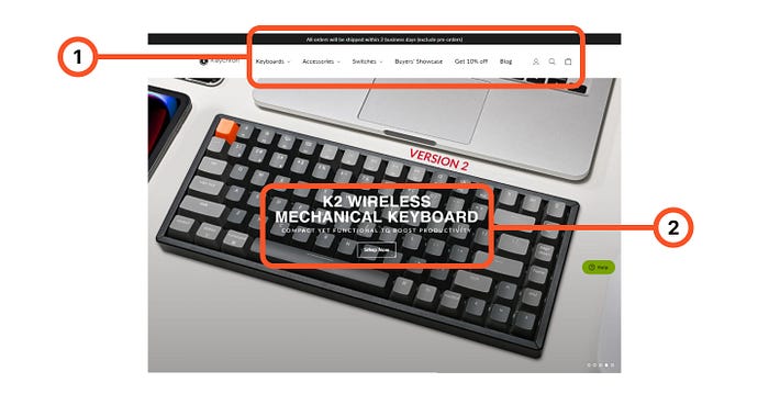
- Since 1 is more clearly distinguishable for the eye, the visitor is distracted and the CTA can be easily ignored, also there is a ‘10% off’ which further drifts the user off.
- The value proposition in the form of a headline is just the name of the product and doesn’t provide value to the visitor; also, the heading along with the CTA which are the most essential parts of a landing page, is not distinguishable from the rest of the elements.
Bonus: Social proof should be included on the first page the visitor sees, this helps in building trust and further increases the chances to convert.
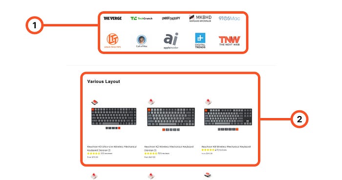
- The social proof section is almost halfway down the whole page, social proof should be included above the fold to build visitor trust and make it more compelling for them to hit the CTA.
- Other products are also listed on the same page which provides a lot of ways for the visitor to get his attention distributed and ultimately off the CTA which converts.
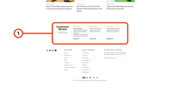
- Customer reviews and testimonials build up the trust of the visitor, here they lack personality.
Overall takeaways 💥
- The headlines and CTA does not provide any value proposition to the visitor.
- There are multiple interactions built-in above the fold which easily distracts the visitor from the CTA.
- Social proof is not added above the fold.
- The page lacks the visuals to support the product.
The New Design 🎨
Since this project's scope is not vast, I have made some assumptions for the visitors moving forward and have designed/offered solutions keeping that visitor base in mind.
The visitors are assumed to be mechanical keyboard enthusiasts/tech enthusiasts.
Why?
Mechanical Keyboards is very niche, not a lot of people buy a mechanical keyboard just because a normal keyboard does the job, it is only the enthusiasts who are looking to buy one.
- The visual design of the landing page has been kept very simple and minimalistic to appeal to the tech enthusiasts, this also reflects from the names attached for the social proof — these are big tech Youtube channels and websites that use a Keychron K2.
- The value proposition is clearly visible through the headline along with the CTA and is easily distinguishable from the rest of the elements. ‘1 Keyboard, Many Devices’ highlights the product's main feature that it can be connected to multiple devices at once. The CTA reads ‘Get yours now’ instead of ‘Buy Now’ to make the product feel personal to the visitor and hence increasing the conversions.
- The main features and highlights of the product are shown in the form of swipeable cards (see the prototype for the interactions and animations), these cards feature a CTA button on them so that the user can immediately decide if the features are what they are looking for.
- Links to YouTube videos are also added on the page to help the visitor hear what others say about the product, this further has the potential to increase conversion rates.
- Some technical details about the different switches offered are added along with the suitable use case to make an informed decision.
- More social proof in the form of quotes from the popular tech Youtube channels and blogs are mentioned. Nothing beats existing customer reviews and testimonials, hence they are highlighted.
- Finally, the CTA button is added at the bottom of the page so that the visitor does not have to scroll back up to the top to buy the keyboard if they have made up their mind.
Here is the final design —

Link to the prototype: https://www.figma.com/proto/jFjFf27oFX5dCO0vND3Ebg/Untitled?page-id=0%3A1&node-id=48%3A108&viewport=-6083%2C-1736%2C0.4539945423603058&scaling=min-zoom
Conclusion 🏁
And that is how I designed a landing page for Keychron K2 as a design challenge by Headout, it took me 4–5 days starting from the initial learnings about landing pages to a fully functioning prototype.
Note: I also tried prototyping in Framer for a change but an unfortunate bug kept on changing the padding and fonts when I imported my Figma files to Framer. Overall, even tho there is a bit of a learning curve; I liked how easy it is to prototype on Framer and the whole new set of features it brings along is amazing!
Let me know what you would have done differently in the comments below!